Your Landing Page Isn’t Selling Software. It’s Selling Clarity.
Most SaaS landing pages try too hard to sound impressive.
But B2B buyers don’t convert because your copy is clever. They convert because:
- They see themselves in your messaging
- They instantly understand what you do
- They trust that the next step is worth taking
This post breaks down what a high-converting SaaS landing page actually needs to say and what to leave out.
The Real Job of a SaaS Landing Page
Your landing page isn’t a homepage. It’s a focused conversion tool with one job:
Move the right buyer from “mildly interested” to “ready to engage.”
That might mean:
- Starting a trial
- Booking a demo
- Downloading a high-intent asset
- Answering a few qualification questions
Related: A Smarter Way to Set Up Lead Funnels
Section 1: Above the Fold What, Who, and Why Now
Here’s what your page must communicate in the first 5 seconds:
- What the product does
- Who it’s for
- Why this matters right now
Bad: “Empowering modern teams to collaborate better.”
Better: “Onboarding automation for remote CS teams.”
Pair that with:
- One subheadline that expands the outcome
- One CTA (“See It in Action”, “Book Demo”, “Start Free” pick ONE)
Related: Homepage Copy That Doesn’t Waste Space
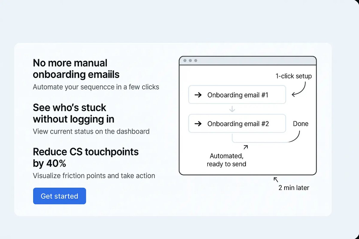
Section 2: 2–3 Pain-Driven Benefits (Not Features)
Don’t list specs. Show how the product solves real problems.
Use simple headlines:
- “No more manual onboarding emails”
- “See who’s stuck without logging in”
- “Reduce CS touchpoints by 40%”
Add:
- Icons or micro-screenshots
- One-sentence explanations
- Optional CTA repeat
Related: Tools SaaS Teams Actually Use in 2025
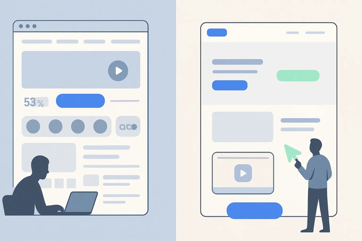
Section 3: Screens That Show, Not Tell
Instead of showing dashboards no one understands, show:
- The exact workflow you’re replacing
- The end state (“here’s what it looks like live”)
- The payoff (“1-click setup, 2 min later”)
Annotate your screenshots with labels that point to:
- Results
- Simplicity
- Relevance
Related: Homepage Structure That Speaks to B2B Buyers
Section 4: Proof That Similar Buyers Already Use It
You don’t need 50 logos or 100 testimonials.
You need:
- 2–3 short quotes from similar roles or companies
- Company logo or vertical label
- Optional: a stat or KPI (“Cut onboarding time by 3 hrs”)
Add these early and repeat them below the CTA.
Related: How Startups Build Authority Without Ads
Section 5: CTA With Context (And No Surprises)
Most SaaS pages bury the CTA under vague promises.
Here’s what works better:
- Be clear about what happens next: “See how it works (2-min walkthrough)”
- Use soft CTA variants: “See Product Demo” instead of “Submit”
- Include optional FAQs near the CTA: “Do I need a credit card?” “How long does setup take?”
Related: Funnels That Convert With Fewer Steps
What NOT to Include on a Landing Page
Avoid clutter that dilutes your message:
- Carousels
- Press logos no one recognizes
- Heavy animation or auto-play videos
- Team bios or blog links
- Competing CTAs (“Learn More”, “Talk to Sales”, “See Demo” pick one)
If a section doesn’t support conversion, cut it.
Related: Website Layouts That Are Working in 2025
What to Say if You’re Early-Stage (and Still Gaining Trust)
Startups without social proof can still convert with:
- Clarity on who this is for
- Specific benefits framed as outcomes
- Transparency about what’s coming next
- Interactive demo previews (e.g. Navattic, Loom walkthroughs)
- Friction reducers: “Try risk-free”, “Guided setup included”, “Live chat support”
Don’t fake trust. Show value fast.
Final CTA: Repeat with Confidence
End your page the way you started:
- Repeat the core outcome
- Reinforce one buyer persona
- CTA again same wording, same style
This gives scanner-type visitors a second chance to convert without scrolling back up.
Conclusion: A Great Landing Page Doesn’t Convince It Confirms
You’re not trying to sell. You’re helping the right people recognize they’re in the right place.
Here’s what to say:
- This is what we do clearly
- This is who it’s for exactly
- This is the problem we solve with evidence
- Here’s what happens if you click no guesswork
Everything else is optional.

Custom video production at scale
Aneeverse covers all video needs whether you're telling your brand story, launching a product or running ads. Discover how we can help you scale.
Frequently Asked Questions
Long enough to answer objections, short enough to keep momentum. Most high-converting pages have 5–7 sections max.
