A Clean One-Page Store Can Outperform a Full Site
You don’t need a 15-page site to sell well.
In fact, most mobile buyers bounce because they’re overwhelmed, lost in navigation, or just waiting too long for the next section to load.
This is why one-page stores work. But only when they’re structured correctly.
This post covers how to design a one-page Shopify (or Webflow) store that’s not just pretty but focused on conversion.
Why One-Page Stores Work (When Done Right)
One-page stores eliminate:
- Navigation friction
- Random distractions
- Extra clicks between awareness and checkout
They force you to prioritize clarity.
But here’s the issue: Most people treat them like a long landing page. They forget the buyer is skimming on a phone.
Let’s fix that.
Related: Homepage Layouts That Work for New Stores
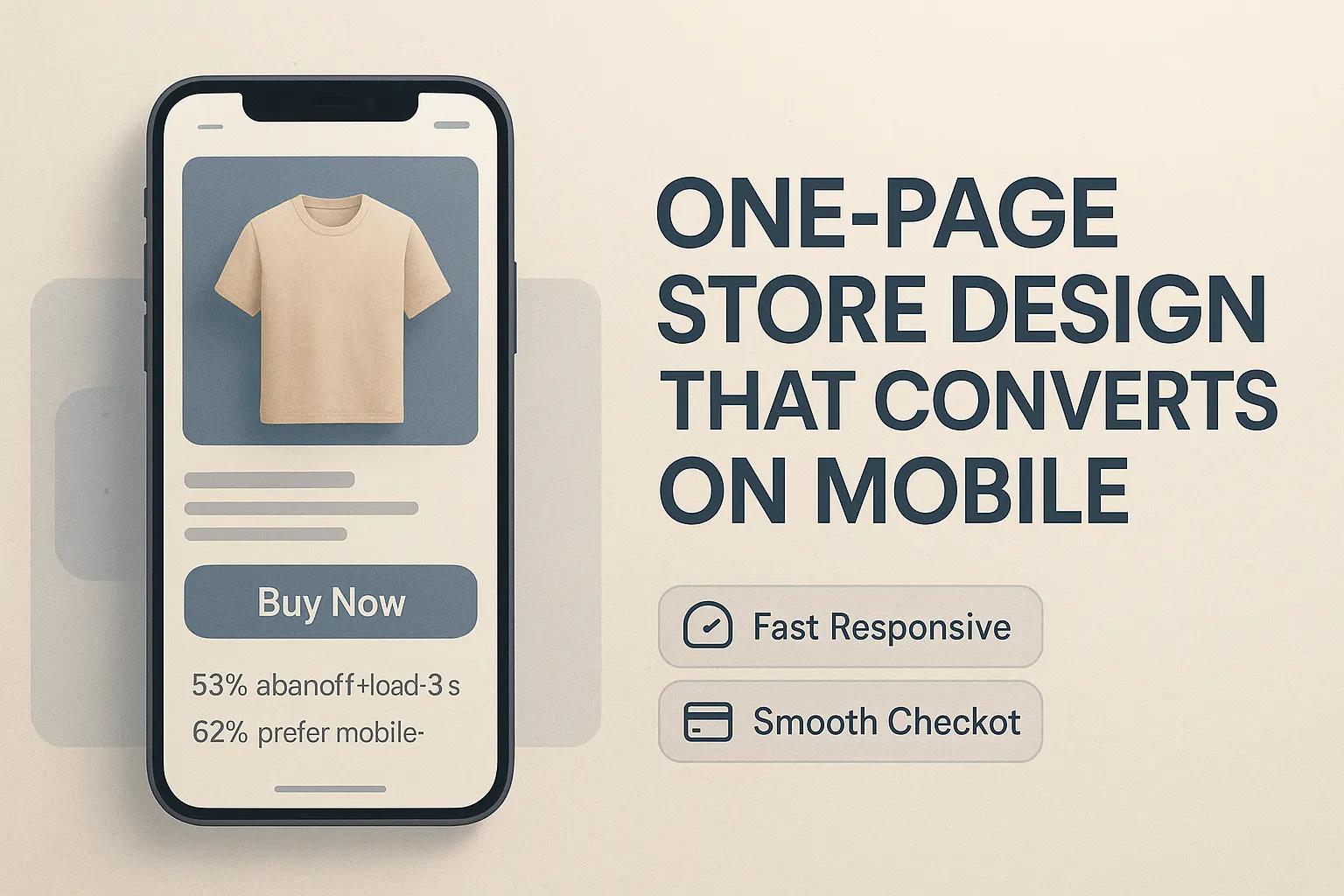
Structure Your Page Like a Funnel, Not a Flyer
Here’s the basic flow that works:
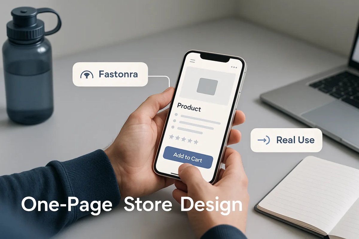
1. Hero with CTA Clear product benefit. One call to action. That’s it.
2. Quick Product Benefits (with Icons) Keep it skimmable. Focus on pain points solved.
3. Social Proof Show 2–4 short reviews. Bonus if they include images or results.
4. Product Gallery + Add to Cart Use tap-to-zoom images and show the product in use.
5. Detailed Specs + Shipping Info Answer sizing, delivery, or use-case questions here.
6. FAQ Address objections like: “Is this returnable?” “Will it fit?”
7. Final CTA One more add-to-cart button. Same one from the top. Repeated.
Fix These Mistakes That Kill Mobile Conversions
Mistake 1: Slow Loading
Use compressed images (WebP), lazy-load anything below the fold, and remove unnecessary animations.
Speed matters. Especially on cellular data.
Mistake 2: CTA Buttons That Get Lost
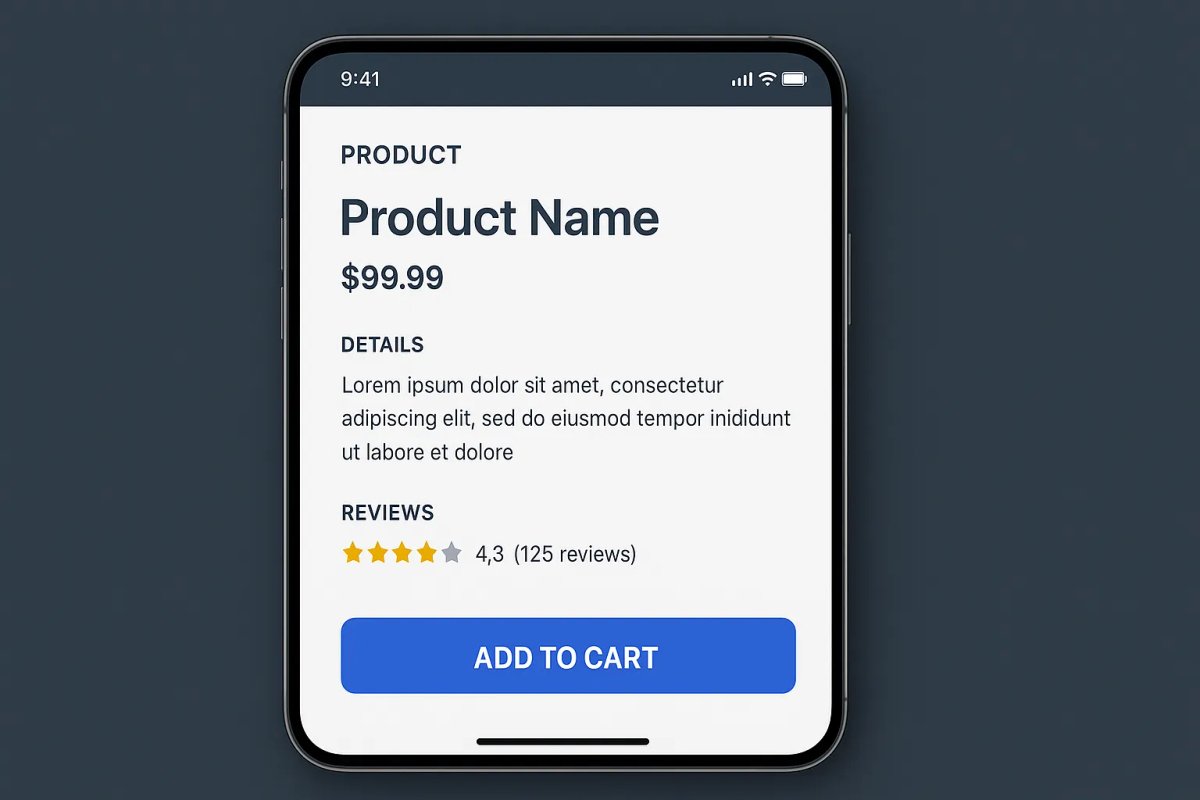
Your add-to-cart button should:
- Appear at the top and near the bottom
- Be sticky or reappear after scroll
- Use contrast color (not grey or secondary)
Mistake 3: Too Much Text
Cut 30–50% of your desktop copy for mobile.
Replace long paragraphs with:
- Icons + 2-word benefits
- Short bullets
- Collapsible sections (for FAQs or policies)
Related: Homepage Copy That Doesn’t Waste Space
Design for Scroll, Not Clicks
On desktop, you can afford navigation menus. On mobile, assume users won’t click anything.
This means:
- No hidden tabs
- No complex carousels
- No links to separate pages unless it’s checkout
Use color breaks or section dividers to guide attention. This helps with orientation and scrolling behavior.
Related: Website Layouts That Are Working in 2025
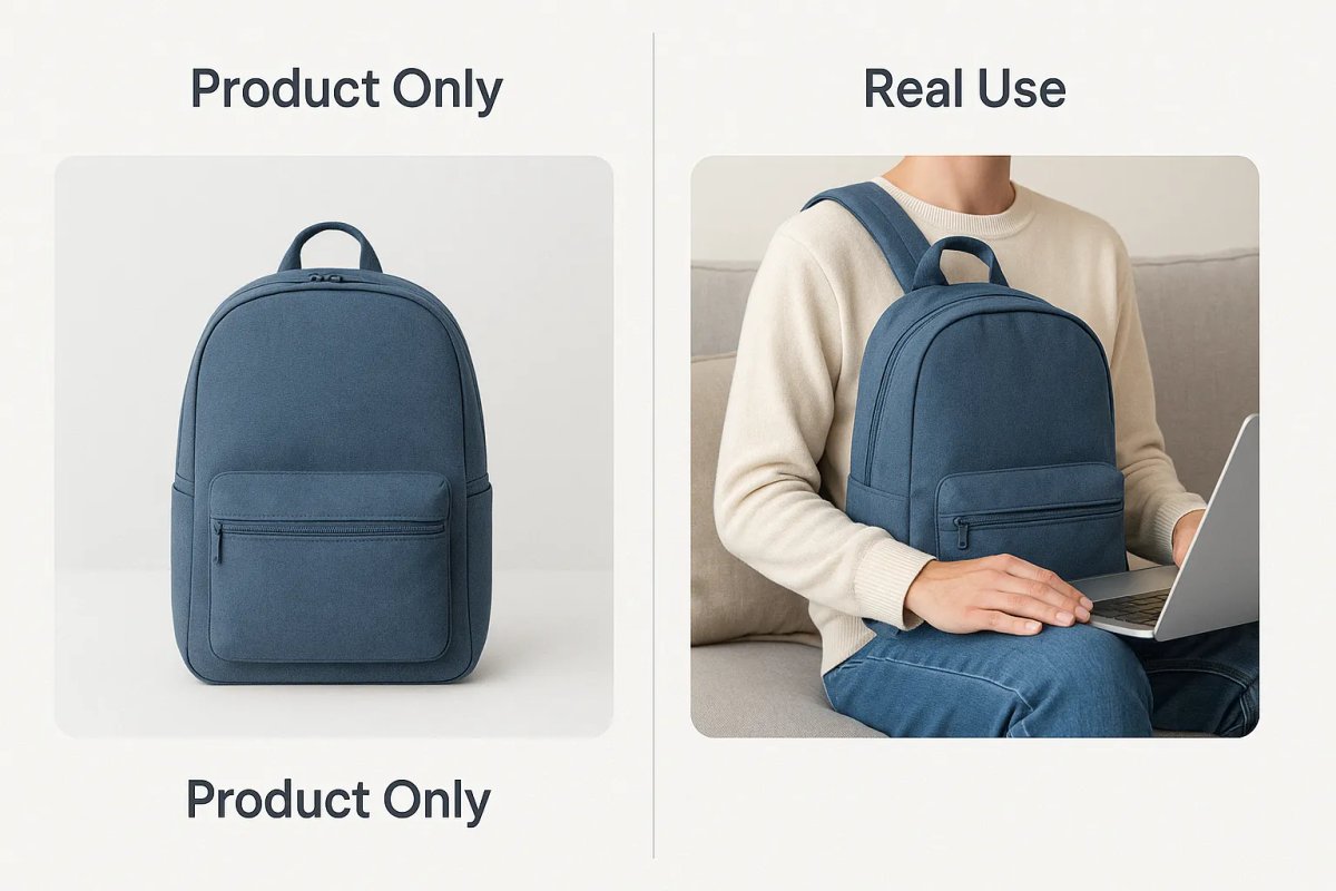
Show Product Use in Context, Not Just Catalog Shots
People don’t just want to see what the product looks like. They want to see:
- How it fits
- How it solves a problem
- What it looks like in real life
Use:
- UGC (User-Generated Content)
- Lifestyle photos
- Side-by-side comparisons (before/after)
Especially important for beauty, fashion, home goods, and gadgets.
Related: A Better Way to Write eCom Product Descriptions
Add Micro-Conversion Elements
You’re not just pushing for purchase you’re earning trust.
On one-page stores, add:
- “As seen on” or press logos
- Trust badges (returns, secure checkout, shipping times)
- Estimated delivery window
- Compact testimonials (3 lines max)
These cues reduce bounce, especially for first-time buyers.
Test With Real Mobile Sessions
Before you launch:
Pull up your site on a phone
Ask someone non-technical to try it
Time how long it takes them to add to cart
Common red flags:
- They don’t scroll far enough
- They miss your CTA
- They tap the wrong section
Fix friction before running traffic.
Related: Sales Funnels That Don’t Confuse Buyers
Conclusion: Clarity + Scrollability = Conversion
One-page stores work because they’re limited.
But that’s only true when:
- The layout mirrors a buyer’s decision journey
- The content is built for mobile, not repurposed from desktop
- The CTA is always accessible
- Images show real use, not just flat shots
If your buyer can scroll, skim, and buy you win.

Custom video production at scale
Aneeverse covers all video needs whether you're telling your brand story, launching a product or running ads. Discover how we can help you scale.
Frequently Asked Questions
You can — but minimize it. Most one-page stores use anchor links to jump between sections rather than separate pages.
