Most Product Pages Aren’t Bad. They’re Just Forgettable.
No typos. Clean layout. Decent photos.
But no conversion.
Why? Because most product pages play it safe:
- Basic features
- Generic bullets
- No emotion
- No urgency
- No visual hierarchy
And in eCommerce, “meh” kills sales just as fast as “bad.”
This post walks you through how to turn a boring product page into one that feels clear, persuasive, and conversion-ready without rewriting everything from scratch.
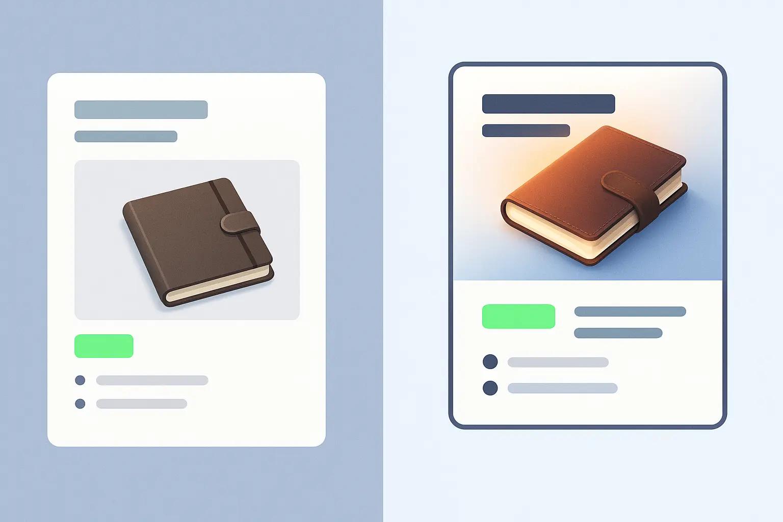
Step 1: Rewrite Your Headline Like It’s an Ad
Most product page titles just repeat the product name.
Bad: “Premium Leather Journal Brown”
Better: “Write More. Lose Less. A Refillable Leather Journal Built for Daily Use.”
Why it works:
- Starts with a benefit
- Gives a hint of the emotional hook
- Still SEO-friendly
Formula: Outcome + Feature = Headline “Keep Gear Dry.” (Outcome) → “With Our Waterproof Roll-Top Bag” (Feature)
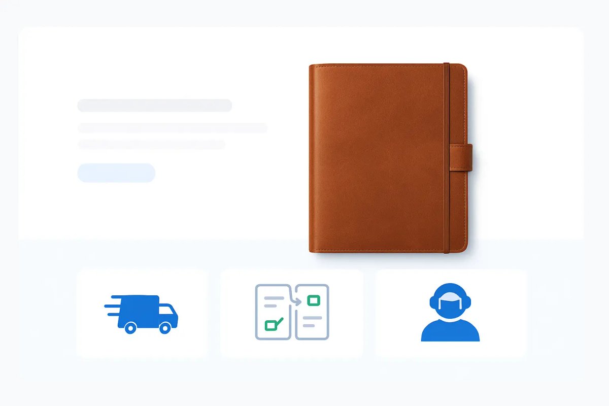
Step 2: Move the Benefits Above the Fold
Your buyer shouldn’t have to scroll to figure out:
- What this solves
- Why it’s different
- If it’s for them
Use:
- 3 short bullet points
- Icons or micro-images
- One short supporting sentence
Examples:
- “Ships in 24h”
- “Refillable in under 10 seconds”
- “Built by a former Air Force pilot”
This keeps the buyer scanning and absorbing.
Step 3: Use Real-Use Images, Not Just Studio Shots
Buyers want to imagine the product in their hands not just on a white background.
What to include:
- Lifestyle shots (product in use)
- Contextual size references (on a desk, in a bag)
- “Zoomed in” details (texture, stitching, clasp, closure)
- UGC or customer photos in a carousel
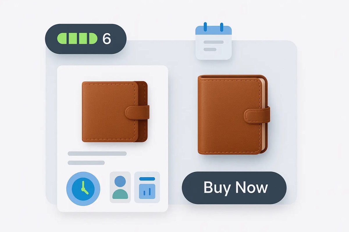
Step 4: Add Urgency Without Using Fake Tactics
Fake scarcity kills trust. But real urgency clarifies decision timing.
Options that work:
- “Only 6 left” (if real)
- “Orders ship in 24h (Next batch ships in 2 weeks)”
- “Inventory refreshes monthly next restock: June 10”
- “Limited edition color gone after May 31”
Also works well with:
- Countdown to seasonal sale
- Pre-order windows
- Low-stock callouts (automated by inventory tools)
Step 5: Use Specific Language That Signals Trust
Kill generic language like:
- “High quality”
- “Perfect for everyone”
- “Premium design”
Replace with:
- “Tested for 400+ uses”
- “Used by photographers, hikers, and journalists”
- “Hand-stitched in Oregon with full-grain leather”
Specific = credible. Vague = forgettable.
Step 6: Put Your FAQs on the Page (Not in a Menu)
FAQs aren’t a support tool. They’re a conversion tool.
Add them to the page, near the bottom and format them to be:
- Collapsible
- Short (2–3 lines max)
- Focused on objections (“Will it fit my laptop?”, “Is it water-resistant?”)
Step 7: Highlight Reviews With a Purpose
Instead of dumping 200 reviews at the bottom, curate 3–5 that reinforce key selling points.
Structure:
- Name + photo (if possible)
- Role or use case (e.g. “Field Technician”)
- What they said (quote)
- What they experienced (e.g. “Lasted through a month-long trip in Nepal”)
Use this as a proof section not just a score.
Step 8: Add Secondary CTAs for Buyers Not Ready Yet
Not everyone is ready to buy right now.
Add a micro-CTA like:
- “Email me when this color is back in stock”
- “Save this for later”
- “Get 10% off your first order”
- “Join waitlist for the XL version”
Capture emails and build retargeting lists without losing the buyer entirely.
Step 9: Show Why It’s Better Than Alternatives
Buyers compare help them do it on your page.
Use a simple comparison block:
- “Why This vs. [generic version]”
- Feature grid: You vs. Other Brands
- Real data (e.g. “Ours: 14-day return. Most: Final sale.”)
This removes decision fatigue and reduces tab-hopping.
Step 10: Reduce the Mental Load at Checkout
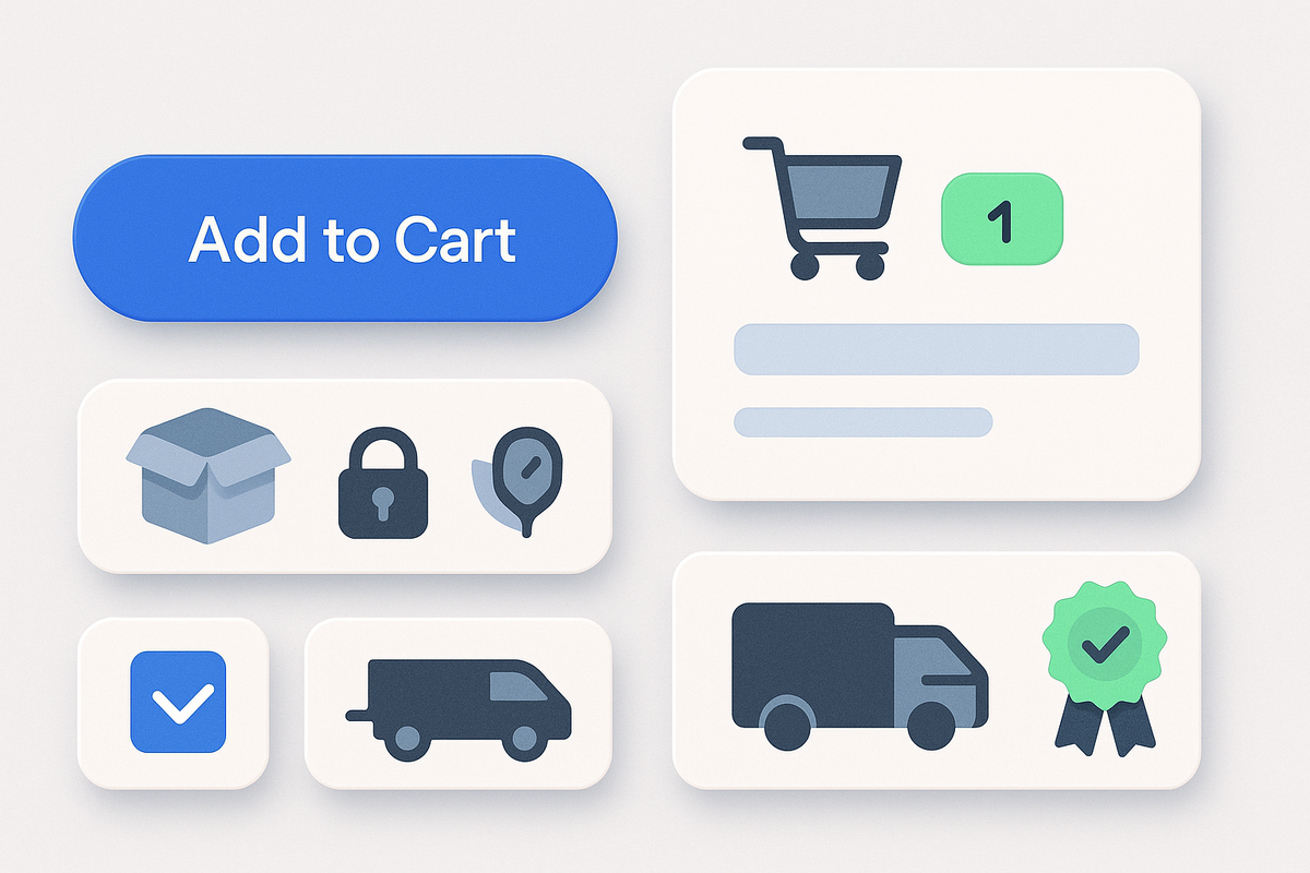
Even if your product page is solid, buyers still hesitate at the last second.
Add cues that reduce friction:
- “Free returns within 30 days”
- “Secure checkout with Stripe/Shopify”
- “Arrives in 2–4 business days”
- “1-year warranty included”
This messaging should show up near the Add to Cart button and in the cart preview.
Conclusion: A Good Product Page Doesn’t “Sell” It Clears the Path.
Fixing a boring product page isn’t about hype. It’s about:
- Writing with clarity
- Showing the product in use
- Earning micro-trust visually and verbally
- Giving the buyer what they need when they need it
A buyer on your page is already curious. A strong page removes the friction between curiosity and conversion.

Custom video production at scale
Aneeverse covers all video needs whether you're telling your brand story, launching a product or running ads. Discover how we can help you scale.
Frequently Asked Questions
At least 5: 1 hero, 1 lifestyle, 2 detail close-ups, 1 in-context. More if you're selling something complex or high-ticket.
