Most B2B Homepages Talk Too Much And Say Too Little.
If your homepage reads like a brochure, you’re losing the deal before the first click.
B2B buyers aren’t browsing casually. They’re checking:
- Is this relevant to my problem?
- Is this made for my role?
- Can I trust this company to deliver?
Your homepage should answer those questions fast without making the buyer scroll forever or decode buzzwords.
This post shows how to structure a B2B homepage that converts curiosity into credibility.
What B2B Buyers Are Actually Looking For
Forget the copywriter fantasy that buyers will read your homepage top to bottom.
They’re scanning for:
- What you do
- Who you serve
- Why you’re worth their time
- Where they go next
If they don’t find that in the first 5 seconds, they bounce.
Related: What a SaaS Landing Page Should Really Say
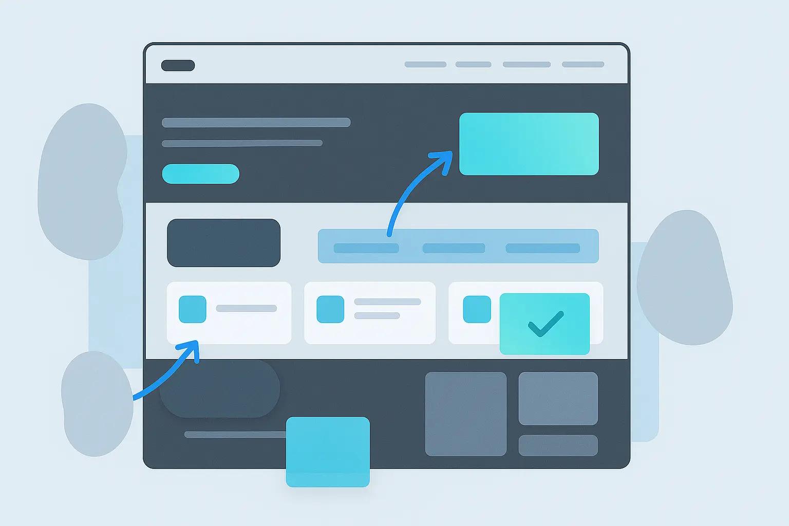
Structure Your Homepage Like a Guided Filter

This structure works whether you’re early-stage or scaling:
1. Headline That Says What You Do Without Buzzwords
- Avoid: “Empowering teams through intuitive innovation”
- Use: “Customer Education Software for Scaling SaaS Teams”
2. Subheadline That Specifies the Problem You Solve
- Example: “Turn your onboarding docs into searchable training workflows.”
3. One Clear CTA
- “See How It Works” or “Get a Demo” not both
Related: Homepage Copy That Doesn’t Waste Space
What Comes Next: Clarity, Not Features
After your hero, don’t dive into specs. Show:
1. Who It’s For (and Who It’s Not) This builds trust faster than listing features.
- “Built for customer success and enablement teams not sales outreach.”
- “Works best for teams with 100–1,000 active users.”
2. What It Doesin 3 Icons Max Use short labels like:
- “Track training progress”
- “Embed docs anywhere”
- “Sync with Slack + Notion”
Related: Tools SaaS Teams Actually Use in 2025
Add Social Proof (High Up Not Buried)

You don’t need 100 logos. Just 3–5 from brands your ICP recognizes.
Best format:
- 2–3 short quotes
- With logo + role (e.g. “Dir. of CS, Zapier”)
- Optional: link to full case study or pull in G2 snippet
This reinforces: “People like me already use this.”
Related: How Startups Build Authority Without Ads
Next: Product Visuals That Answer Questions
B2B buyers don’t want abstract illustrations. They want to see:
- The product
- In context
- Solving a problem they recognize
Use actual screenshots (blurred if needed) and annotate:
- What this screen is showing
- Why it matters
- What result it enables
Even better: include a 30–60 sec silent autoplay demo.
Related: Chatbots That Don’t Sound Robotic
Layer in Trust Signals Without Clutter
Under the product section, use:
- Security badges (SOC2, GDPR, etc.)
- “Used by teams at…” with real logos
- Recent awards only if recognizable
- Link to your help center or support contact

No need to over-design this. Just make it scannable.
CTA Strategy: Repeat, Don’t Multiply
Most homepages fail here.
Do this:
- Use one main CTA (e.g. “See It in Action”)
- Repeat it after each major section
- Use the same style and wording every time
Avoid having:
- “Contact Us” + “Start Trial” + “See Demo” + “Book a Call” all competing
One action = more conversions.
Related: A Smarter Way to Set Up Lead Funnels
Footer = Navigation + Credibility
A good footer has:
- Short nav (Docs, Pricing, Contact, Careers)
- Legal links (Terms, Privacy)
- Optional: investor or parent company if known
- One last CTA (yes, again)
Your buyer may scroll to the bottom just to see if you're real.
What NOT to Include

These slow down high-intent B2B buyers:
- Brand videos with no transcript
- Feature lists with no context
- Paragraphs about “our mission to transform industries”
- Sliders, animations, and auto-rotating carousels
Less movement = more clarity.
Related: Website Layouts That Are Working in 2025
Conclusion: Speak to the Buyer, Not the Boardroom
Your homepage isn’t a brochure. It’s a shortcut to trust.
Make sure it answers:
- What is this?
- Who is it for?
- What does it help me do?
- Can I trust this company?
- What do I do next?
B2B buyers don’t need more options. They need one clear reason to keep reading.

Custom video production at scale
Aneeverse covers all video needs whether you're telling your brand story, launching a product or running ads. Discover how we can help you scale.
Frequently Asked Questions
If possible, yes — even a starting point. Hiding pricing creates friction, especially in mid-market SaaS.
