Your Homepage Isn’t for Everyone. It’s for the Buyer Who's Almost Ready.
Most new store owners overload their homepage long brand intros, carousels, blog sections, "our story," and endless menus.
That kills conversion.
Your homepage isn’t your blog. It’s a landing page. Its job? Guide a semi-interested visitor to a product they might buy fast.
This post covers what to show, what to skip, and how to layout a homepage that performs even when you're new.
Skip These Homepage Traps (Especially if You're Small)
Before we talk about what to include, here's what to cut:
- Carousels (most visitors don’t scroll past the first slide)
- Long paragraphs about your mission (they don’t care yet)
- Complicated menus (too many paths = no direction)
- Newsletter pop-ups that trigger in 2 seconds
Your homepage should feel like a clean pitch. Not a crowded hallway.
Related: Homepage Copy That Doesn’t Waste Space
Structure Your Homepage Like a Guided Walkthrough

Use this default order it works across industries and store sizes:
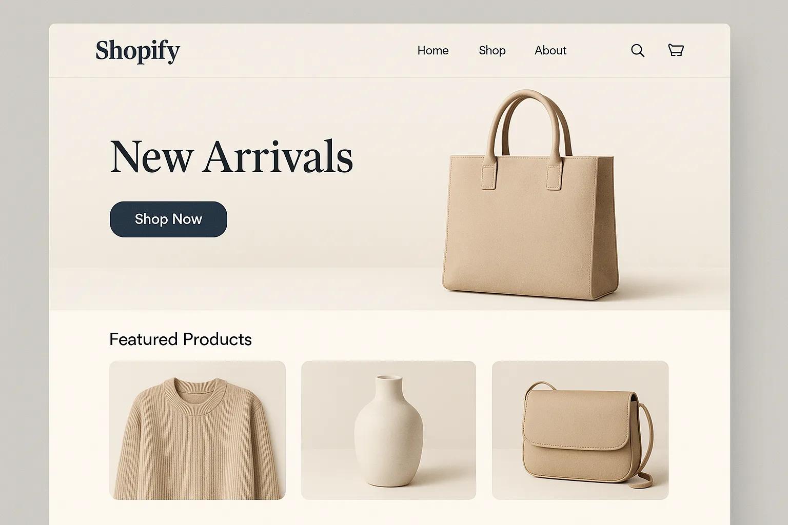
1. Hero Section (1 CTA only)
- One sentence benefit-focused headline
- One subheadline (optional)
- One primary button (e.g. “Shop Now”)
2. Product Highlights (Top 1–3 SKUs)
- Use cards or tiles
- Include review stars and short tags (“Bestseller”, “New”)
- One-click add-to-cart if possible
3. Value Proposition (3 Icons Max)
- Focus on what makes your store low-risk or unique
- Use icon + 3-word benefit (e.g. “Ships in 24h”)
4. Social Proof Section
- 2–3 real reviews with photos
- Bonus: show UGC or a short “as seen on” row
5. Footer With Quick Links
- Shipping policy
- Returns
- Contact
- Socials (if active)
Related: A Smarter Way to Structure Your Navigation
Use Fewer CTAs But Repeat Them
If your homepage has 6 different CTAs, you’re diluting intent.
What works better:
- One core CTA repeated at top, middle, and bottom
- Same color, same text (“Shop Our Collection” or “Start Browsing”)
If your product is a subscription, use “Get Started” or “See Plans.”
Avoid vague CTAs like “Learn More” or “Discover Our Brand” they don’t drive action.
Prioritize Visual Flow Not Just Branding

Most first-time visitors will scroll for 5–7 seconds before bouncing.
You don’t need:
- Heavy branded photography
- A video background
- Custom animation
You do need:
- A first image that makes the product instantly clear
- A legible headline that doesn’t blend into the photo
- Mobile layouts that stack cleanly
Related: Website Layouts That Are Working in 2025
Let Product Cards Do the Talking

If you only have a few products, use them as your homepage content.
Each product card should show:
- Main image
- Price
- Review stars
- Label (“Bestseller”, “Only 3 Left”, “New”)
- Clickable area for cart or detail page
If a product is your hero, put it in the first section don’t bury it under branding fluff.
Related: Fix This in Your Product Listings to Rank Better
Add Social Proof Early (And Reuse It Below)
Most new stores hide reviews at the bottom.
Instead:
- Add a testimonial with a photo in your hero or product card
- Show at least 1 review in the first screen
- If no reviews yet, use early feedback from friends/testers (label it as such)
As reviews grow, create a dedicated section below your value props.
Related: How to Collect Reviews Without Breaking Rules
Test Above-the-Fold Load Speed + Layout
Homepage load speed still matters especially for first-time visitors.
Tools like PageSpeed Insights or GTmetrix help you see:
- Time to First Paint
- Largest Contentful Paint (LCP)
- Mobile layout load order
Best practices:
- Compress hero image (WebP, under 200kb)
- Lazy-load anything below the fold
- Avoid full-screen pop-ups on load
Related: What to Track When Your Shopify Ads Flop
If You Only Have 1 Product Own It

Single-product stores shouldn’t pretend to be catalogs.
Use this layout instead:
Hero image with 1-line pitch + CTA
Short feature-benefit section
Demo GIF or image walkthrough
Compact FAQ
Add-to-cart button again
Footer with support info
You’re not selling a brand. You’re selling one product sell it hard.
Related: One-Page Store Design That Converts on Mobile
Conclusion: Your Homepage Is a Funnel, Not a Museum
Your homepage has one job: Get semi-interested visitors to the product page.
That means:
- Show the product clearly in the first 5 seconds
- Minimize friction (menus, carousels, vague CTAs)
- Repeat the same CTA consistently
- Use real reviews early
- Let visuals + layout lead not branding for branding’s sake
The smaller your store, the less distraction you can afford.

Custom video production at scale
Aneeverse covers all video needs whether you're telling your brand story, launching a product or running ads. Discover how we can help you scale.
Frequently Asked Questions
Only if you have social proof and a high-converting product section already. Otherwise, move it to “About” or the blog page.
